← All workREPLICAHead of Design · Aug 2020 – Aug 2024
Design system · MUI · Storybook · 2020 – 2024
One source of truth for data-heavy UI.
Built on the MUI suite of UI tools and implemented in Figma, the Replica Design System is a centralized source of truth that empowers consistent standards across a recognizable family of product experiences, with clear rules for maps, tables and charts.
The Replica Design System in Figma, with a matching MUI and Storybook library.
Summary · 2 minutes
The short version.
50%less design-to-development time, at best
3–7step color ramps, so the same dataset renders the same way everywhere
The problem
Replica’s product surface had grown faster than its standards. Designers were re-solving the same UI problems, handoff quality was uneven, and map, table, and chart styles drifted between features.
The approach
1Tokens that travelType, color and spacing tokens as the bedrock for accessibility, theming and developer ergonomics.
2Design and code in lockstepThe Figma library and Storybook shared the same tokens and names.
3Data patterns firstReplica lives on maps, tables, and charts, so the system does too.
What we did
01FoundationsType scale, semantic colors, choropleth and heatmap ramps, spacing and grid.
02ComponentsButtons, inputs, tables, menus, dialogs and icons, with states and dark mode.
03Data patternsMaps, charts and range filters that render consistently across studies.
04Adoption ritualsWeekly office hours and short pattern reviews.
The full story
6 chapters.
01Why we built it
The product grew faster than its standards.
Replica’s product surface had grown faster than its standards. Designers were re-solving the same UI problems, handoff quality was uneven, and map, table, and chart styles drifted between features. We needed a single source of truth in design and code so teams could ship faster with higher consistency.
02Foundations
Tokens that travel.
Type, Color, and Spacing tokens are the bedrock. Tokens drive accessibility, theming, and developer ergonomics.
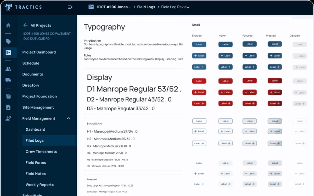
The typography scale and line-heights that keep dense tables readable without fatigue.Semantic colors plus purpose-built choropleth and heatmap ramps used in maps and charts.Grid and container rules so layouts stay aligned across pages and screen sizes.
03Components
The shared building blocks.
We defined buttons, inputs, tables, menus, dialogs, and iconography with states and dark mode coverage.
Primary, secondary, icon, and dark variants with state behavior.Dense and default table styles, selection, sorting, and list-style panels for saved items.
04Data patterns
Where the system pays off.
Replica lives on maps, tables, and charts. We built patterns that make analysis faster and more trustworthy.
Basemap styling, link width ratios for network volumes, legend formats, and 3–7 step ramps so the same dataset renders consistently across studies.Summary cards, histograms, and range filters that pair with charts in the same panel for “see and set” interactions.
05How it shipped
Adoption, releases and docs.
Design and code in lockstepThe Figma library and Storybook shared the same tokens and names so designers and engineers spoke the same language.
Adoption ritualsWeekly office hours and short pattern reviews kept teams unblocked and the library honest.
Release pathNew patterns launched behind flags, then graduated once quality bars and a11y checks passed.
Docs that teachEach page explains why a rule exists, when to use it, and how to extend it for edge cases.
06The impact
Less drift, faster handoff.
Reduced UI drift and rework by giving product teams a single library that covered maps, tables, and charts.
Enabled faster onboarding for new designers and engineers through clear examples and Storybook parity.
Reduced design to development time by up to 50 percent through the new design system and patterns.
Looking back
What it led to.
What’s next
Faster onboarding for new designers and engineers, through clear examples and Storybook parity.