← All workTRACTICSProduct Design & Strategy Lead · Aug 2024 – Aug 2025
Audit · IA · Design system · Aug 2024 – Aug 2025
Order, consistency and speed for a fast-growing product.
Strategically transforming user experience through exhaustive audits, IA refinement, and a scalable design system for a construction management platform.
Tractics field log review on the new system, with the typography and color foundations.
Summary · 2 minutes
The short version.
25%faster feature delivery with standardized components and guidelines
50%less design-to-development time, at best, through dev-ready handoffs
The problem
Tractics had grown quickly, but the UI and UX were inconsistent and fragmented. Screens were designed in isolation, patterns varied across features, and the lack of a system made every release slower and riskier. Customer success lacked guidance, and users faced friction navigating the product.
The approach
1Audit everything firstPage-by-page UX audits, a full IA map and a deck of findings before designing anything.
2Build on MUICustomize a proven library to Tractics’ brand instead of starting from zero.
3Roll out in phasesTypography, colors and icons first; navigation last, so feature work never stopped.
What we did
01Deep auditsEvery page in Figma, every interaction in a FigJam IA map.
02Design systemComponents, type, color and states, documented for Dev Mode.
03Site-wide prototypeResponsive, with light and dark mode through Figma variables.
04Phased rolloutMinimal disruption to feature development and support.
The full story
7 chapters.
01The challenge
Fast growth, fragmented experience.
Tractics had grown quickly, but the platform’s UI and UX were inconsistent and fragmented. Screens were designed in isolation, patterns varied across features, and the lack of a system made every new release slower and riskier.
Customer success teams were left without clear guidance on how to support new functionality, and users often faced friction when navigating the product. The challenge was to bring order, consistency, and scalability to the product while improving speed of delivery and overall usability.
02Problem identification
What the audits found.
Complex and confusing navigationUsers encountered dead ends and orphaned pages.
Inconsistent user interfaceNo standardized components, typography, or colors.
Poor developer documentationDev teams had minimal interaction guidance, leading to constant rework and ambiguity.
Full IA auditEvery page and interaction, mapped in FigJam.Full UI/UX auditPage-by-page UX audit in Figma.
03Deep audits
Strategic insights, in a deck.
Performed exhaustive UX page-by-page audits (Figma), identifying usability flaws.
Created a detailed IA map (FigJam), visualizing every interaction.
Developed a strategic slide deck summarizing key insights and proposed solutions.
A slide from the Tractics audit deck: navigation and information architecture.
04Design system
A scalable system on MUI.
Leveraged and customized the MUI library to align with Tractics’ brand identity.
Created detailed components, typography rules, color palettes, and interaction states.
Enhanced developer experience through detailed documentation and Figma Dev Mode.
The Tractics design system: typography, color and building blocks in light and dark.
05Prototype and validation
A site-wide clickable prototype.
Enabled comprehensive navigation and interaction testing.
Integrated responsive design with components optimized for web and mobile.
Supported light and dark mode through advanced Figma variables.
06Rollout strategy
Incremental, by design.
Recognizing resource constraints, I landed on a practical phased rollout. This approach ensured minimal disruption to ongoing feature development and customer support activities.
Phase 1FoundationsTypography, colors, icons
→
Phase 2ComponentsBasic components and layout updates
→
Phase 3NavigationNavigation and interaction enhancements
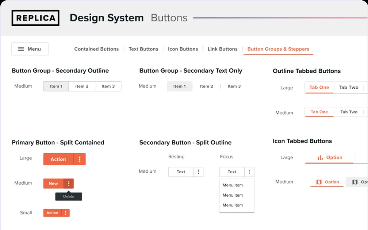
A strategy and execution slide: why the audit issues mattered, and the button and color standards that answered them.
07What I learned
More than a design system.
This work went beyond creating a design system; it standardized components and UX patterns across the platform. Consistency in layouts, tables, and interactions reduced ambiguity, sped up delivery, and improved usability.
Key lessons included the value of incremental rollouts and the importance of focusing on interaction patterns, not just visuals. Just as critical, early alignment with product and customer success ensured smoother launches and stronger internal support for new features.
25%faster feature delivery
50%less design-to-development time, at best
Looking back
What I learned.
LESSON 1Roll out incrementallyPhasing the change kept feature development and customer support moving.
LESSON 2Interaction patterns matter as much as visualsConsistency in layouts, tables, and interactions reduced ambiguity and sped up delivery.
LESSON 3Align early with product and customer successEarly alignment made launches smoother and built internal support for new features.
What’s next
Improved cross-team enablement: customer success and engineering aligned for smoother launches.